Posted Feb 17, 2020
When creating a web page, it's generally advisable to use native HTML elements as much as possible. You get all of the accessibility semantics and keyboard interactions for free, out of the box. In fact, this is such good advice that the W3C went to the point of making a rule about it:
...or more accurately:
If you can use a native HTML element or attribute with the semantics and behavior you require already built in, instead of re-purposing an element and adding an ARIA role, state or property to make it accessible, then do so.
In short, instead of using a <div> and plastering it with extra ARIA and Javascript to make it accessible, it's better to just use a <button> element. It's a lot less work and a lot more reliable.
But while this is certainly sound advice, and better for accessibility when it comes to compatibility and functionality, the same can't necessarily be said when it comes to styling.
The browser default component styles will certainly get the job done. But they can be improved. Take the checkbox for example. It will certainly pass for contrast requirements, but the hit area is frankly pretty tiny. Granted, if you've labelled your checkbox properly, then the label will expand the hit area, but some folks could easily still have difficulty seeing the thing at that tiny little size. So let's make it better.
How not to do it
Since checkbox elements don't have a whole lot of flexibility when it comes to styling, a common solution is to just visually hide the whole darn thing and replace it with an image:
input[type="checkbox"] {
  opacity: 0;
  width: 0;
  height: 0;
  position: absolute;
}

label::before { /* could also be a <span> or other element */
  background-image: url('unchecked_checkbox.png');
  width: 20px;
  height: 20px;
}

input[type="checkbox"]:checked + label::before {
  background-image: url('checked-checkbox.png');
}
This approach is great in that it's relatively simple and works without Javascript. The trouble is that it completely breaks if your user has Windows High Contrast Mode (WHCM) enabled:
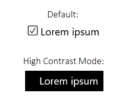
This is because browsers strip out CSS background images when WHCM is turned on to prevent them interfering with the readability of the text. In fact, this approach is even a WCAG failure. Fortunately, this problem is actually quite easy to solve, and we can even gain some additional benefits along the way.
Tip: For those of you following along at home, you can use the keyboard shortcut Left Alt + Left Shift + Print Screen to turn WHCM on and off when viewing the Codepen demos. You'll have to use Firefox, IE, or Edge though—it's not supported in Chrome
SVG to the rescue
If you're not using SVG already, then you really should be. It's accessible, scalable, can be animated and otherwise manipulated with CSS and Javascript... the list goes on and on. We're going to take advantage of some of these properties to build a solution that will not only not break in WHCM, but actually adapt to our user's preferences.
The first step is to get ourselves an SVG checkbox graphic. I'm going to borrow one from Zondicons and tweak it a bit. After running it through SVGOMG to clean up the markup a bit, we're left with this:
<svg viewBox="0 0 20 20" xmlns="http://www.w3.org/2000/svg">
<polygon points="0 11 2 9 7 14 18 3 20 5 7 18"></polygon>
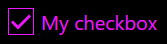
</svg>Add a little bit of styling to the outer <svg> element to add a box around the checkmark, and we have ourselves a nice little checkbox:
See the Pen Custom checkboxes done right (Pen 1) by James Catt (@jcatt) on CodePen.
Notice the use of currentColor. If you're not familiar with it, currentColor is a CSS keyword that will inherit whatever the CSS color is for the element it's used on. In this case, it's black—because that's what we set the color to on the <svg> element. But what's critical here is that when WHCM is turned on, currentColor will update along with whatever text color the user has specified. If they set their text to be hot pink, your checkbox will be hot pink too.
Also, don't forget to add some styling for focus states, since the browser default focus indicator will disappear along with the <input> element.
Making it functional
Next we can adapt the CSS strategy from the original approach to show/hide the checkmark.
See the Pen Custom checkboxes done right (Pen 2) by James Catt (@jcatt) on CodePen.
Snazzing it up
Because we're working with inline SVG, we can even add a CSS transition just for kicks.
See the Pen Custom checkboxes done right (Pen 2, animated) by James Catt (@jcatt) on CodePen.
Just be sure to disable the transition for those that don't want animations, using the prefers-reduced-motion media query.
Vue-flavored
If you're not into vanilla HTML and CSS, you can do this in Vue as well. The same CSS approach will work, but you can also just as easily use a v-if to toggle the <polygon> based on the component state. Just note that the transition effect won't work with this approach.
See the Pen Custom checkboxes done right (Pen 3) by James Catt (@jcatt) on CodePen.
Wrapping up
And there you have it—custom checkboxes for everyone. The best part about it is that the principles involved can be adapted to work for almost any design, no matter how fancy. By using <svg> and currentColor, our solution:
adapts to the user's color scheme in Windows High Contrast Mode
will scale to any size without becoming blurry or pixelated
can display as checked/unchecked by toggling the
<polygon>through your method of choicecan even be animated if you go for that sort of thing
Go forth, and check some boxes!

